Visualizations
In this section all visualizations of the plugins are described shortly. There are two visualizations that visualize the email traffic (Bar Chart and Treemap) and three visualizations that visualize email threads (Word Cloud, Git Graph, Dependency Graph). Email Traffic visualization give an overview about the amount of emails in labels while thread visualizations focus on analyzing the content of a thread. Currently only English language is supported for email analysis.
Bar Chart
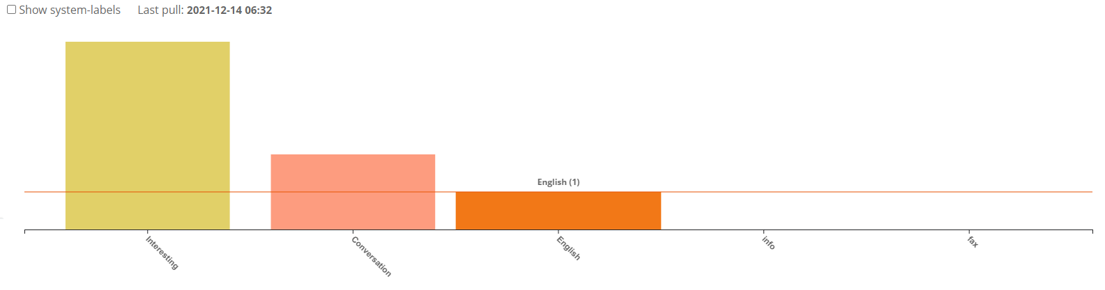
The Bar Chart gives an overview of the email traffic. Each bar represents how many emails a specific label have. Since there are most often much more emails in system (Gmail-generated) labels than custom (user-made) labels we made a checkbox to show/hide system labels. System labels are shown in red and custom labels are shown in different colors. When the user hovers over a bar the visualization shows how many emails exists in the selected label. In the picture only one email exists with the label “English”.
Tree Map
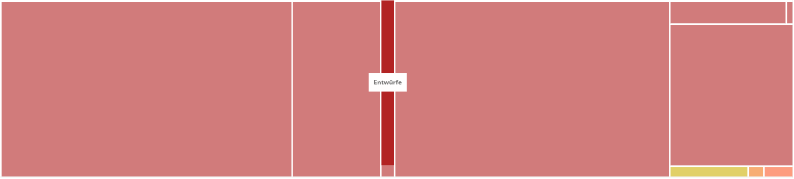
The Tree Map is an alternative visualization to the Bar Chart. Each rectangle represents how many emails a specific label have percentually. System labels are shown in red and custom labels are shown in different colors like in the Bar Chart. As you can see in the picture, there are much more system labels (red) than custom labels (not red). When selecting a rectangle, the specific label headline is shown.
Word Cloud
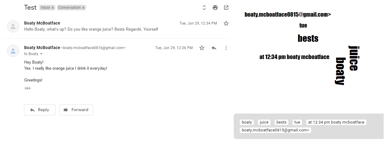
An email thread is a list of related email messages. A thread starts with the original email and gets bigger every time someone replies to the original or a succeeding email. Gmail already shows a conversation view: The newest reply is shown at the top and the oldest (original) message at the bottom We try to analyze all messages of a thread.
The Word Cloud analyzes the content of every email in a thread and finds the most important keywords. These keywords are shown in a word cloud. More important keywords are shown bigger. The word cloud in the picture is pretty small, in larger emails there are more keywords to show. If there are too many keywords, only the most important are shown that fit into the visualization. The user can click on any of the keywords to create a new label with the name of the keyword. Additionally a list of the most relevant keywords (sorted descending by importance) can be shown below the word cloud.
Git Graph
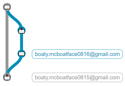
The Git Graph visualizes the structure of a thread as a git graph. For every participant of the conversation a new branch is generated. When someone replies to another participant the branches are merged. The picture above shows a simple conversation between two participants (a send-reply scenario). The first participant sends an email (node with closed mail icon) and the second participant receives the email (node with open mail icon). After that, the second participant sends an email back to the first participant.
The participant names are shown at the right side of the visualization. When an email is send as CC or BCC this is written before the icon in the node.
Dependency Graph
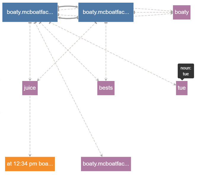
The Dependency Graph shows dependencies between the participants and keywords of an email thread. This visualization neither highlight keywords as good as the word cloud nor shows the relations between replies as clearly as the git graph, but it gives an insight what participants are in this email thread and what keywords belong to which participant.
Every keyword belongs to a category (either noun, people, place, organization, date or value). We show every category in different colors. When the user hovers over a keyword the specific category is shown. The user can hide keywords and only show participants if he wants too.